Psychotic Break Time
Mar11
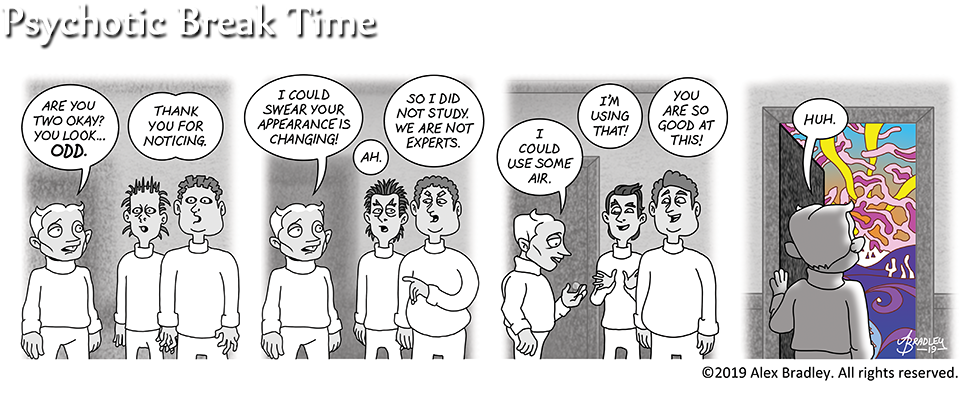
Now I’ve done it. I’ve made it even more expensive to print volume 2 of Miskatonic U! I kept going back and forth on whether I wanted to use color, but ultimately this just looks cooler and is not a bad place to introduce “colors out of space.”
I’m finding this interlude curiously disturbing to write and draw… thanks, drugs!


The color is actually a shock to the system here. It gives a great feeling for what Ernest is experiencing as he goes wandering off into his own head without a map.
It’s weird, I actually don’t feel right including color in the strip, which means of course that it’s the only way to go.
It just struck me. That last panel is like Dorothy opening the door to Oz in the movie. I’m kinda slow that way.
Reminds me of the 2010 Color out of Space movie. All done in B&W, except for the eponymous Color, which works for depicting an unearthly color.
Looks like Earnest might have done better to stay at school!
That’s a pretty good film! The same team is veeerrrryyy slowly working on a film set in the Dreamlands. I can’t wait!